It’s been nearly a decade since I’ve had a website of my own, despite being an active User Experience (UX) designer and developer. The Covid-19 Pandemic (2020-202?) with its various lock downs, working from home and not having to rush about getting to the office, the gym or the pub has given me the opportunity to spend a few moments here and there to invest some time and thought to this little experiment.
I don’t have lofty goals, this is just somewhere that I can make notes on topics that I feel are important to me, post some little workshop experiments and practice my writing skills - I am a developer after all, not a copywriter.
Whenever I start a new project, the developer in me, always beings by thinking about the underlying technologies and how I’m going to build and run this site, but I tried to push those thoughts into a dark little corner of mind and try to focus on the UX, design and content.
Logo
I have a slight obsession with geometric and symmetrical patterns, so I knew whatever identity I created had to incorporate one, if not both of these concepts.
My first attempt was a“connected hexagon”, and I was fairly happy with it - I even animated it. But, after a while it’s symmetry didn’t feel right, so I went back to sketch to try something new.

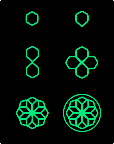
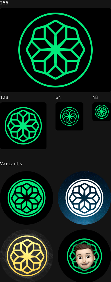
For the new logo, I landed on a funky hexagonal flower shape. It started out as a single hexagon, which was elongated in one direction to make a diamond shape, which is then duplicated seven times to give me an octagon of hexagons - like I say, slightly obsessed with geometric patterns. Although the shape works well on it’s own, surrounding the logo in a circle gives it more balance.

The shape and symmetry of the logo lends itself to lot of different sizes, styles and reinterpretations, which gives me the option to update it in the future.

Type
Typography was the next focus. I’d previously paired the connected hexagon logo with the Jaapokki font, as the angular style looks really good, and matches my handwriting some what.
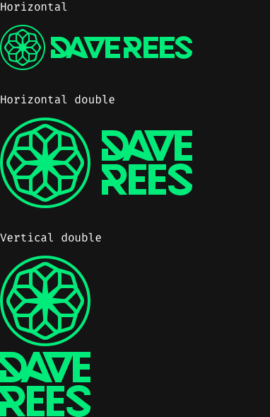
This time around I wanted to emphasise the angular blocky look, for which Kontanter, was nearly perfect. After tweaking the “e’s” to be a little more readable and customising the letter spacing, the type looks monolithic, angular and bold.

Importantly the fixed height, means it works across a single or double line. And, the adjusted letter spacing on both the first and last names means the width are the same - lending the type to work at different sizes and orientation to the logo.
Build
After drafting a quick layout in Sketch, and working out my font pairing; Faustina and Fira Sans Semi Bold, I wanted to get cracking with some code. My first thoughts were to grab a copy of Craft CMS and setup a new project for myself. We use it prolifically at work, mainly because it’s so easy to use and its developer friendliness. I haven’t had much opportunity to work in Craft CMS as much I would like to recently due to other responsibilities, but it felt a little overkill for my needs, and I wanted to be closer to the underlaying code.
I was tempted to just throw everything together in a set of twig templates. But, the lack of logic for listing out posts was a little off putting, as I didn’t want to have to manually manage that. I therefore, started look for a static site generator. I really didn’t want to have to learn a whole new JavaScript framework, templating language or have to manage an overly complicated build process, so I started to play with 11ty. It met almost all of my requirements, with the exception of template language, but it supports so many of them, it turned out to be a non-issue. I used Nunjucks, as it seemed to be the most widely supported.
There are few things that need refining, specifically heading tag hierarchy. On the homepage, the H1 is my introduction, the H2 is the title of each of the posts, and H3-H6 belong to the post content. However, when you view a single post, the H1 is the post title and H2-H6 belong the post content.
As the full content of each post is outputted on the homepage, there’s a mismatch between heading tags. I’ve decided to structure the posts for the homepage for the moment, but it’s something I need to fix before long - let me know if you have any suggestions!
Going forward I’d like to look at how the CSS is organised, the the aim to try and reduce ‘Render blocking’. At some point I need to rewrite the JavaScript so it’s not reliant on jQuery too.
I’m intending to keep the site updated with new posts and small ‘workshop’ projects in the future… @me if I don’t!